Stray Note
Brand identity for a theatre and film production company.

Overview
Stray Note is a theatre and film production company drawn to work that is dream-like or a little quirky, with productions that often reach into the worlds of music and dance. The identity needed to carry the same off-kilter charm as the stories it fronts: playful without tipping into whimsy, and personal enough to feel authored rather than corporate.
Strategy
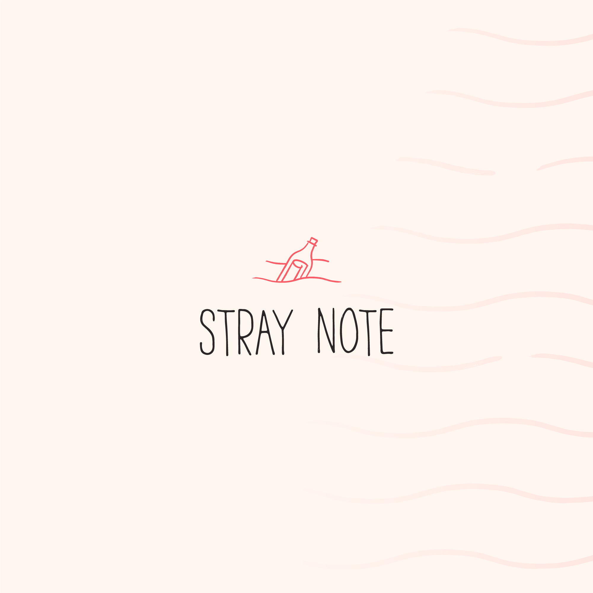
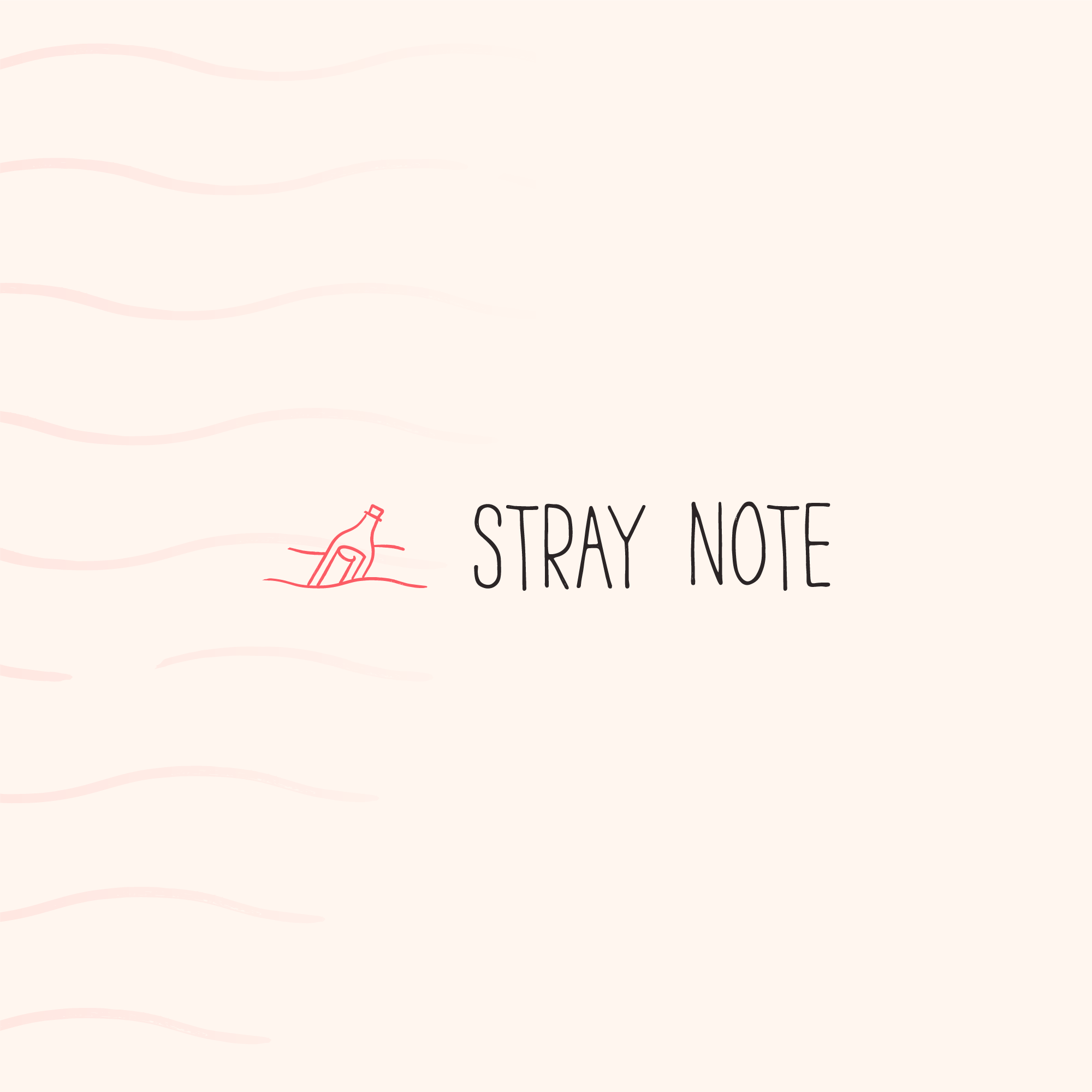
The concept uses a message in a bottle as a graphical stand-in for the name: a note set adrift, carried by chance until it finds whoever it was meant for, much like a stray note of music drifting off the score. The mark shows a corked bottle half-sunk in the water with a rolled note visible through the glass. It is drawn by hand rather than constructed, and the wordmark is hand-lettered to match, so the whole identity carries the texture of a pen instead of a typeface, a loose and human quality that suits the company's dream-like storytelling. The waves breaking around the bottle extend into a repeating background pattern, and a single coral red against off-white keeps the system simple to print and easy to place.
Deliverables
Stacked and horizontal logo lockups, hand-lettered wordmark, and a supporting wave pattern.
Tools
Adobe Illustrator