Notsoda
Brand identity for a design and code studio in Barcelona.
Overview
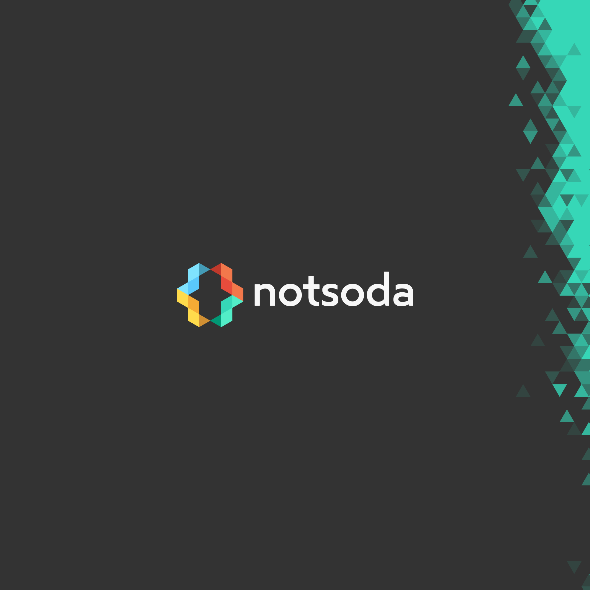
Notsoda is a small studio crafting websites and interactive experiences with equal weight on design, UX, and code. The identity reflects a principle of quality over quantity - an artisan approach that values close client relationships over fast output, and real craft over the bubbly hype ("soda") of the industry. The name is deliberately read as one word, "notsoda", so the "not" never stands apart and tips the brand into negativity.
Strategy
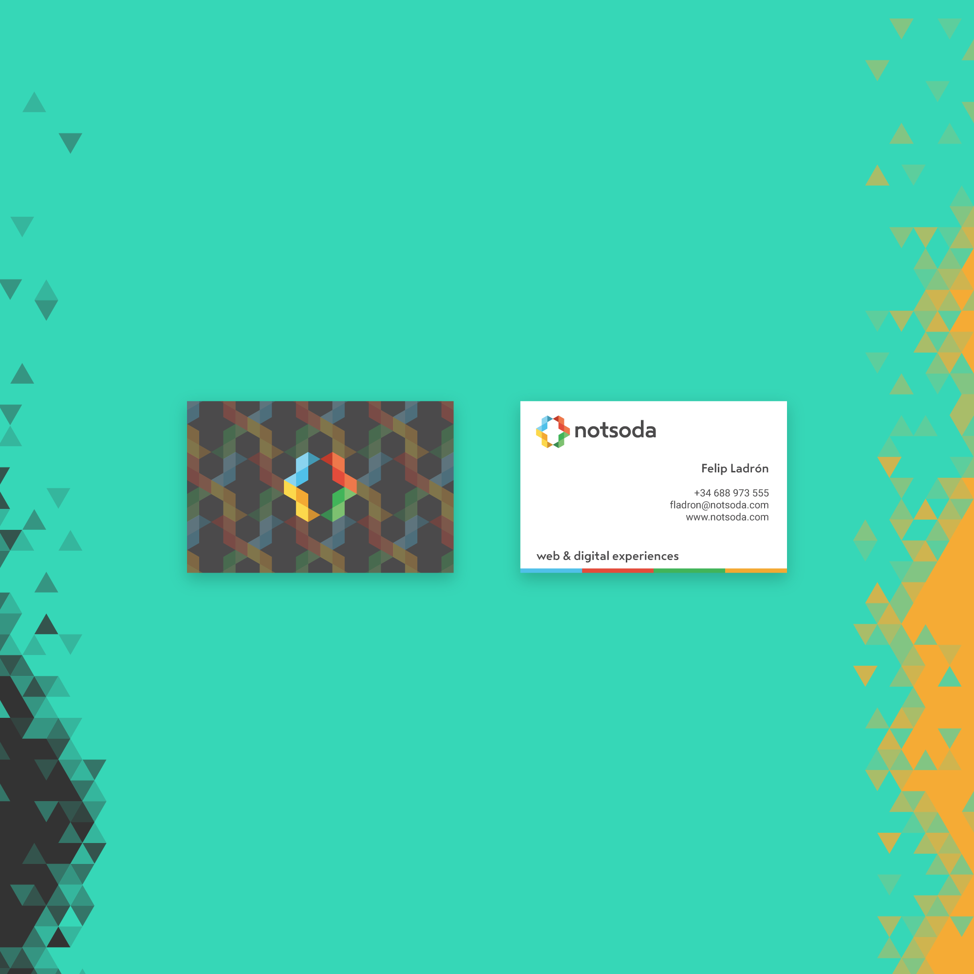
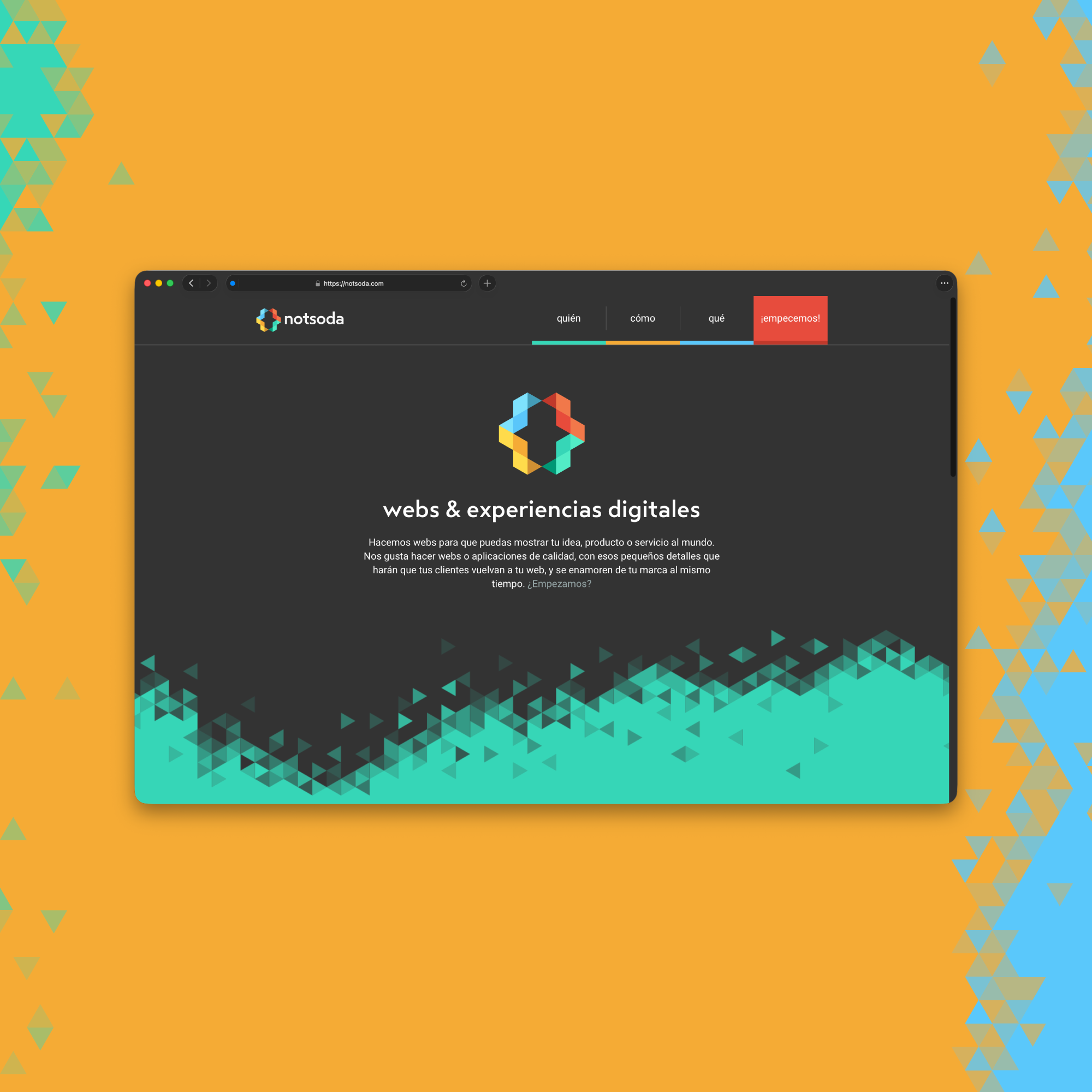
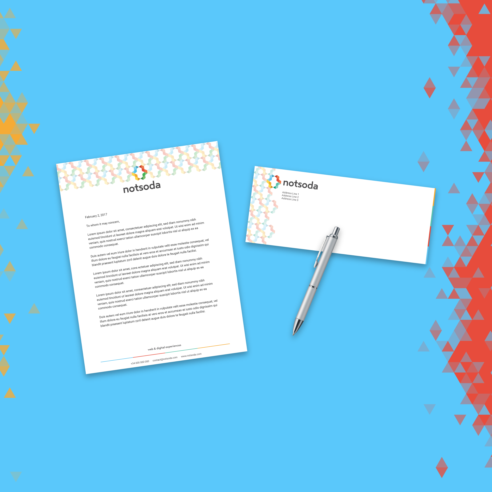
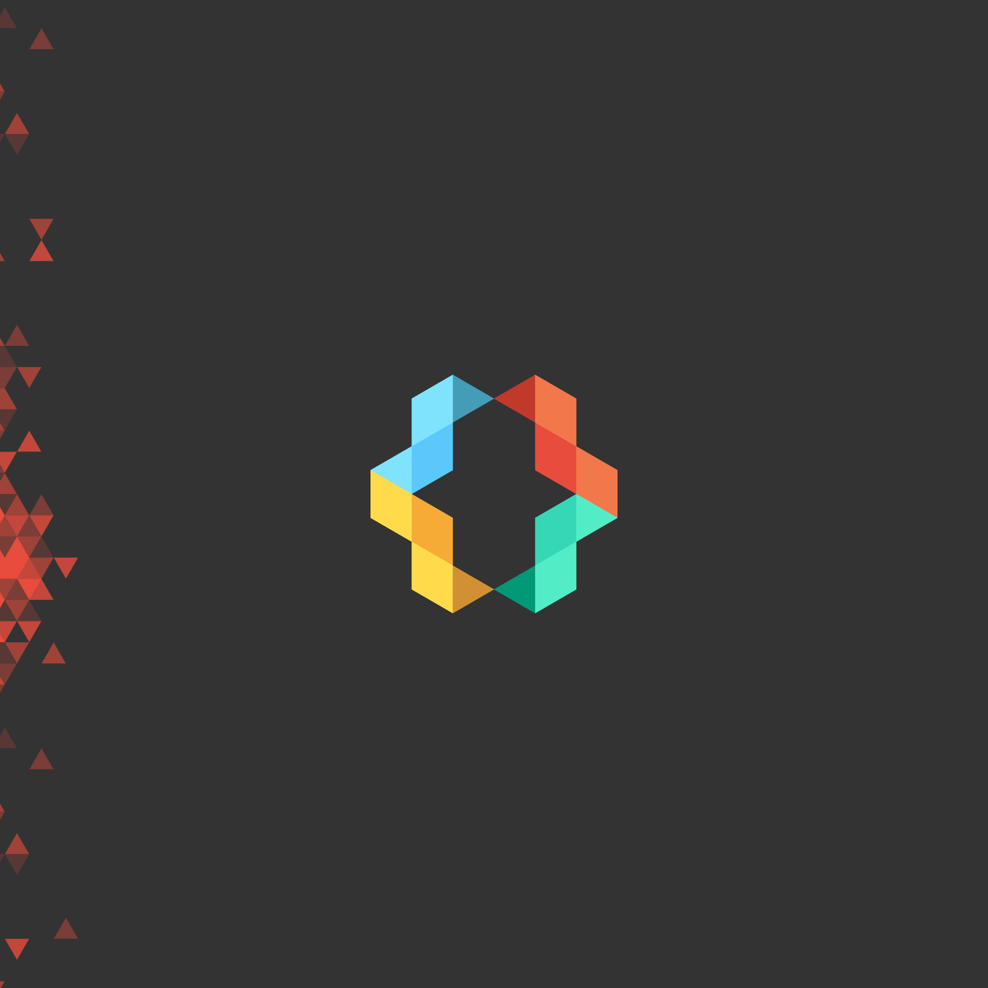
The logo is built from triangular tiles arranged into a curly-bracket ({ }) shape - a nod to code that doubles as a recurring motif across the website, stationery, and business cards. The visual system draws from the Panot, Barcelona's floral tile and a symbol of the city's eclectic, surprising creative spirit. The palette is deliberately multi-chroma: four to five distinct colors, one per section of the website, used to signal different services and moods. Colors complement the logo rather than being locked to it, giving the brand room to breathe across contexts.
Deliverables
Logo, stationery (letterheads, envelopes), business cards, multi-color website, and a supporting icon set.
Tools
Adobe Illustrator, Adobe Photoshop, HTML / CSS / JS